Color theory is a fundamental aspect of design that plays a critical role in various fields, including architecture. In today’s world, 3D visualization has become an indispensable tool for architects, allowing them to create realistic representations of their designs and communicate their ideas effectively. This blog post will explore the importance of color theory in 3D visualization for architecture, highlighting its impact on the design process and its ability to convey the intended atmosphere and emotions of a space.
The Role of Color Theory in 3D Architectural Visualization
Color theory is a study of how colors interact and the psychological effects they can have on the viewer. It provides a solid foundation for designers to create harmonious color schemes and evoke specific emotions or moods. In 3D architectural visualization, color theory is crucial in achieving accurate and visually appealing representations of architectural designs.
1. Visual Appeal and Realism
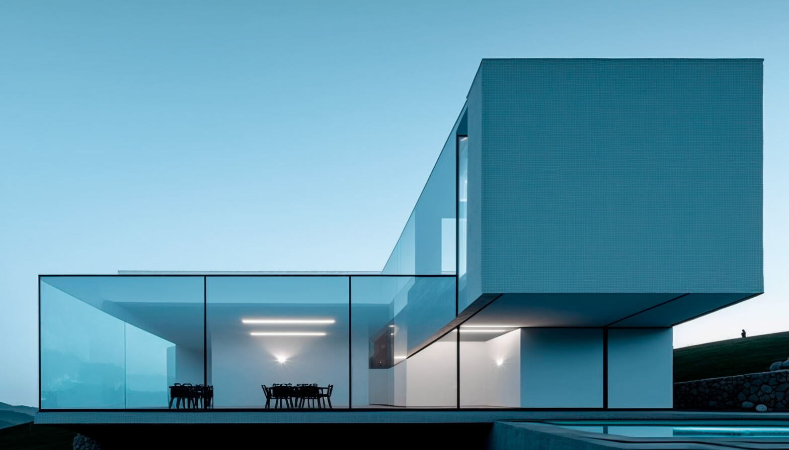
Color is a vital element in creating visually appealing and realistic 3D visualizations. By understanding color theory, architects can make informed decisions about the color palette used in their visualizations, ensuring that they accurately represent the materials and finishes of the structure. This, in turn, helps clients and stakeholders to get a better understanding of the final outcome of the project.

2. Harmony and Balance
Applying color theory principles in 3D architectural visualization can help create a sense of harmony and balance in the design. A well-balanced color scheme can enhance the overall aesthetic of a space, making it more pleasing to the eye and easier to understand. This is particularly important when presenting architectural concepts to clients who may not be familiar with technical drawings and plans.

3. Emotional Impact
Colors have a significant impact on our emotions and perceptions, and this
effect is magnified in 3D architectural visualization. By carefully selecting and
combining colors, architects can evoke specific emotions or moods in their
visualizations, helping to convey the intended atmosphere of the space. For
example, warm colors can create a sense of comfort and coziness, while cooler
colors can create a feeling of calm and tranquility.
The Application of Color Theory in the Design Process
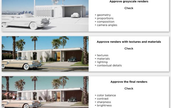
The implementation of color theory in 3D architectural visualization can be divided into three main stages: planning, conceptualization, and final rendering.
1. Planning
During the planning stage, architects should consider the overall color scheme of the project, taking into account the intended atmosphere and the materials and finishes that will be used. By establishing a clear color palette early in the design process, architects can ensure consistency throughout the project
and avoid potential clashes or inconsistencies in the final visualization.
2. Conceptualization
During the conceptualization stage, architects can use color to help refine their design ideas and visualize different options. By experimenting with various color combinations and observing their effects on the 3D model, architects can make informed decisions about the final color scheme and its impact on the overall design.
3. Final Rendering
In the final rendering stage, the chosen color scheme is applied to the 3D model, with careful attention to detail and accuracy. This stage involves adjusting lighting, textures, and materials to ensure that the colors are represented accurately and realistically. The final renderings can then be used for presentations, marketing, and communication purposes.

Color Theory Techniques and Tools for 3D Architectural Visualization
To effectively apply color theory in 3D architectural visualization, architects can utilize various techniques and tools, such as:
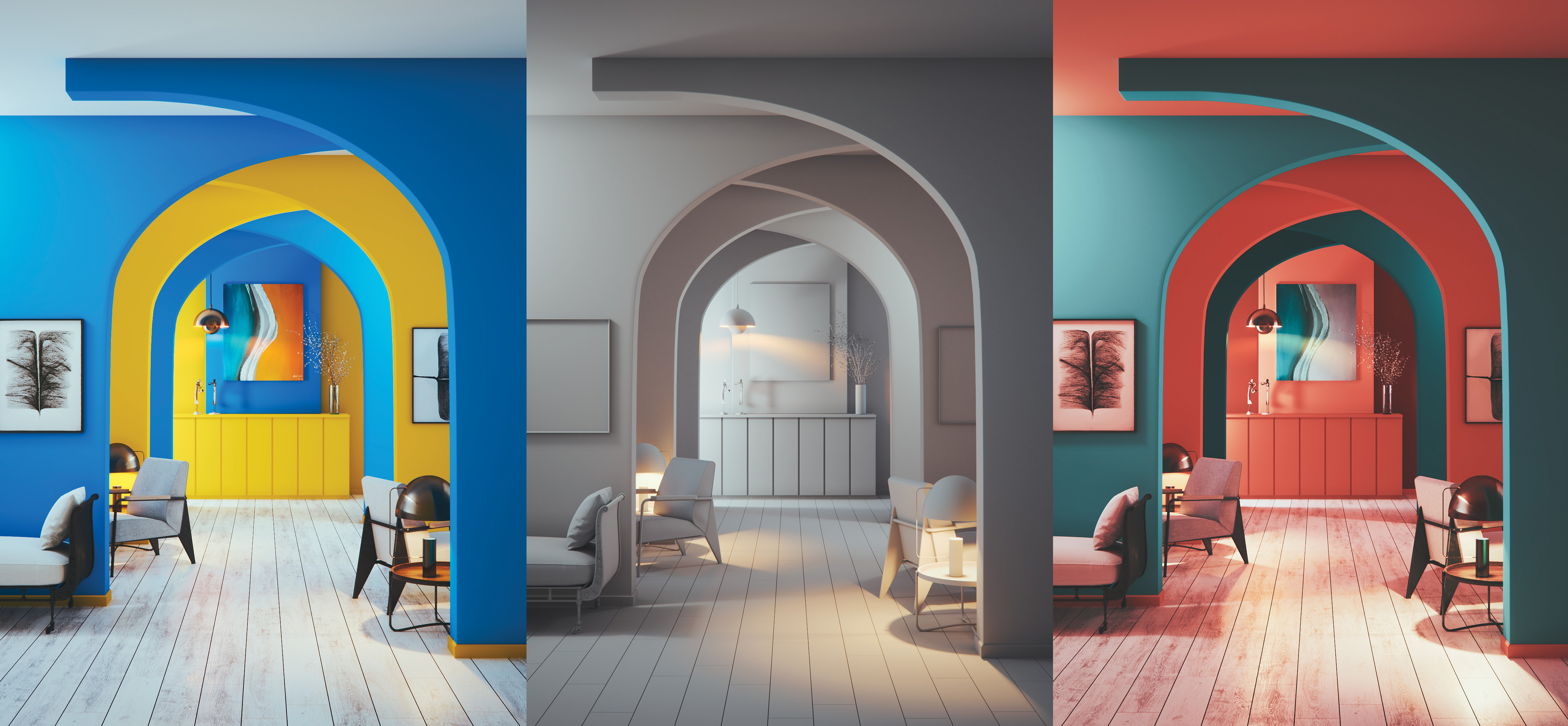
Color Harmony
Color harmony refers to the arrangement of colors in a way that is visually pleasing and balanced. There are several methods for achieving color harmony, including the use of complementary colors, analogous colors, and triadic color schemes. These techniques can help architects create visually appealing and consistent color schemes for their 3D visualizations.
Color Contrast
Color contrast is the difference in color between two or more elements in a composition. By utilizing color contrast effectively, architects can accentuate specific areas of their design, create visual interest, and improve legibility. This can be particularly useful in highlighting key features or focal points within the 3D visualization.
Digital Color Tools
There are numerous digital color tools available that can assist architects in applying color theory to their 3D visualizations. These tools include color palette generators, color wheels, and color-picking tools, which can help architects to select and experiment with different colors and combinations.
In conclusion, color theory is an essential aspect of 3D architectural visualization that plays a significant role in the design process. By understanding the principles of color theory, architects can create visually appealing, realistic, and emotionally impactful representations of their designs. This not only aids in the communication of design ideas but also contributes to the overall success of a project. By incorporating color theory techniques and tools into their workflow, architects can elevate their 3D visualizations to new levels of excellence.